Linkedin App Redesign
Mobile App UI Redesign
Personal Project · 2021
SUMMARY
LinkedIn, with over 830 million users across 200 countries and more than one billion downloads, remains a significant player in the professional networking sphere. Despite its popularity, the app's user interface (UI) has remained relatively stagnant, failing to keep pace with modern design trends in social media platforms. The current UI suffers from information overload, lack of clear grouping, and a dated appearance, potentially deterring new users and failing to engage existing ones effectively.
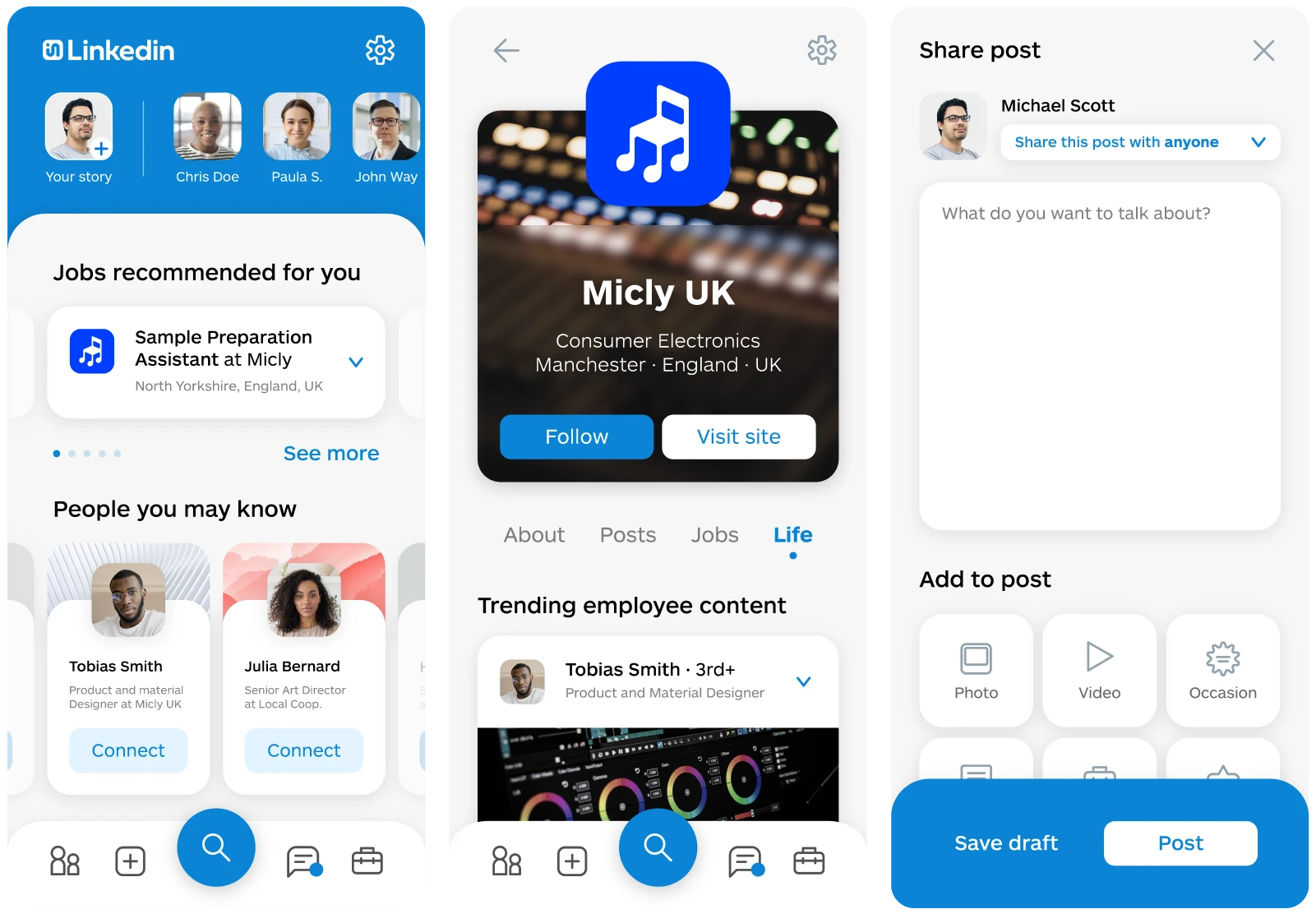
Brand Update
The first step in the redesign process was to modernize LinkedIn's brand identity. The existing blue color scheme and iconography, reminiscent of early 2000s design trends, were replaced with a vibrant blue (#0077B5) to enhance visual appeal and align with contemporary aesthetics. The icon underwent a significant redesign, evolving into a stylized symbol representing a new employee entering the workplace, while maintaining the recognizable "in" motif. The logo was simplified and optimized for readability, with a focus on the iconic symbol followed by the brand name in a clean sans-serif font.
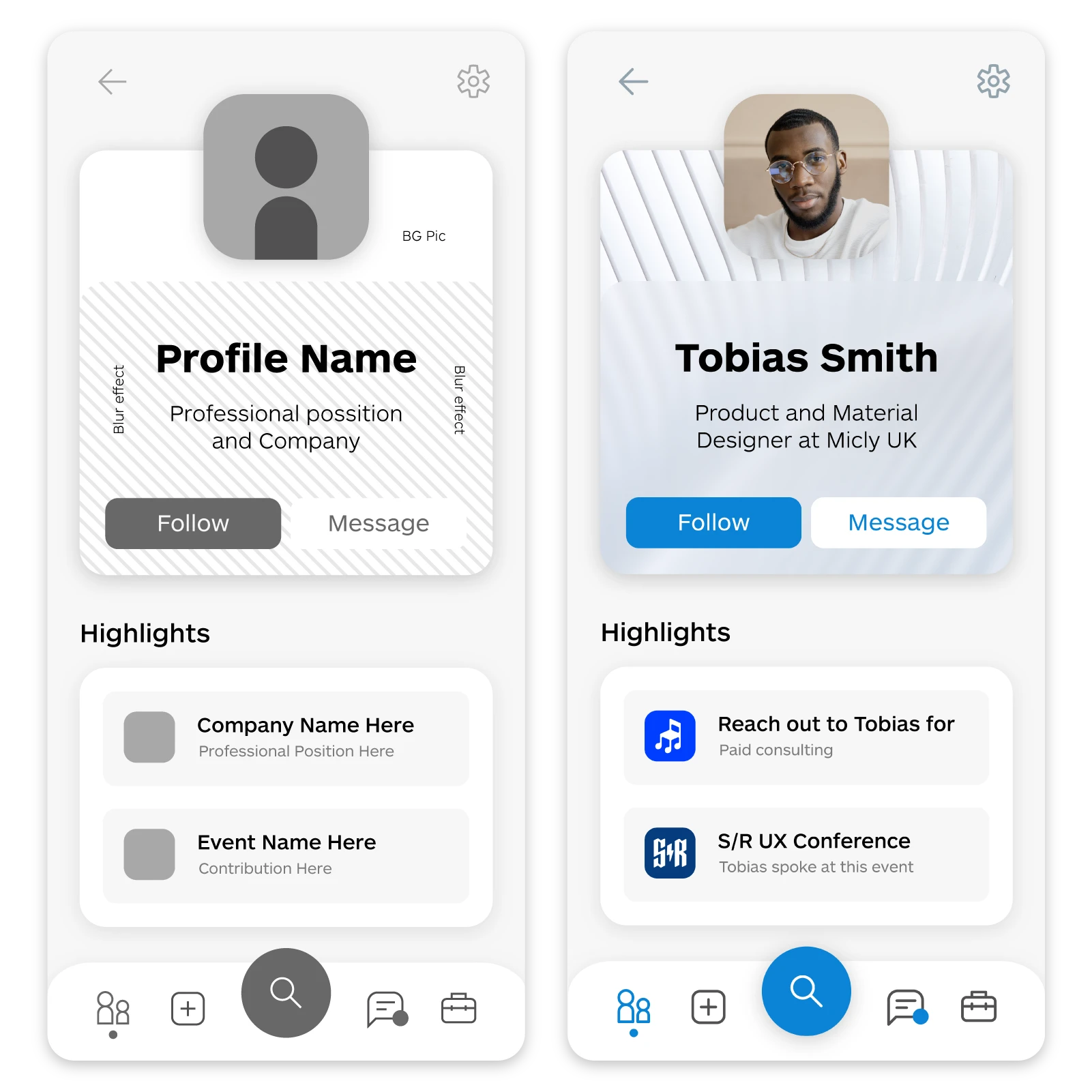
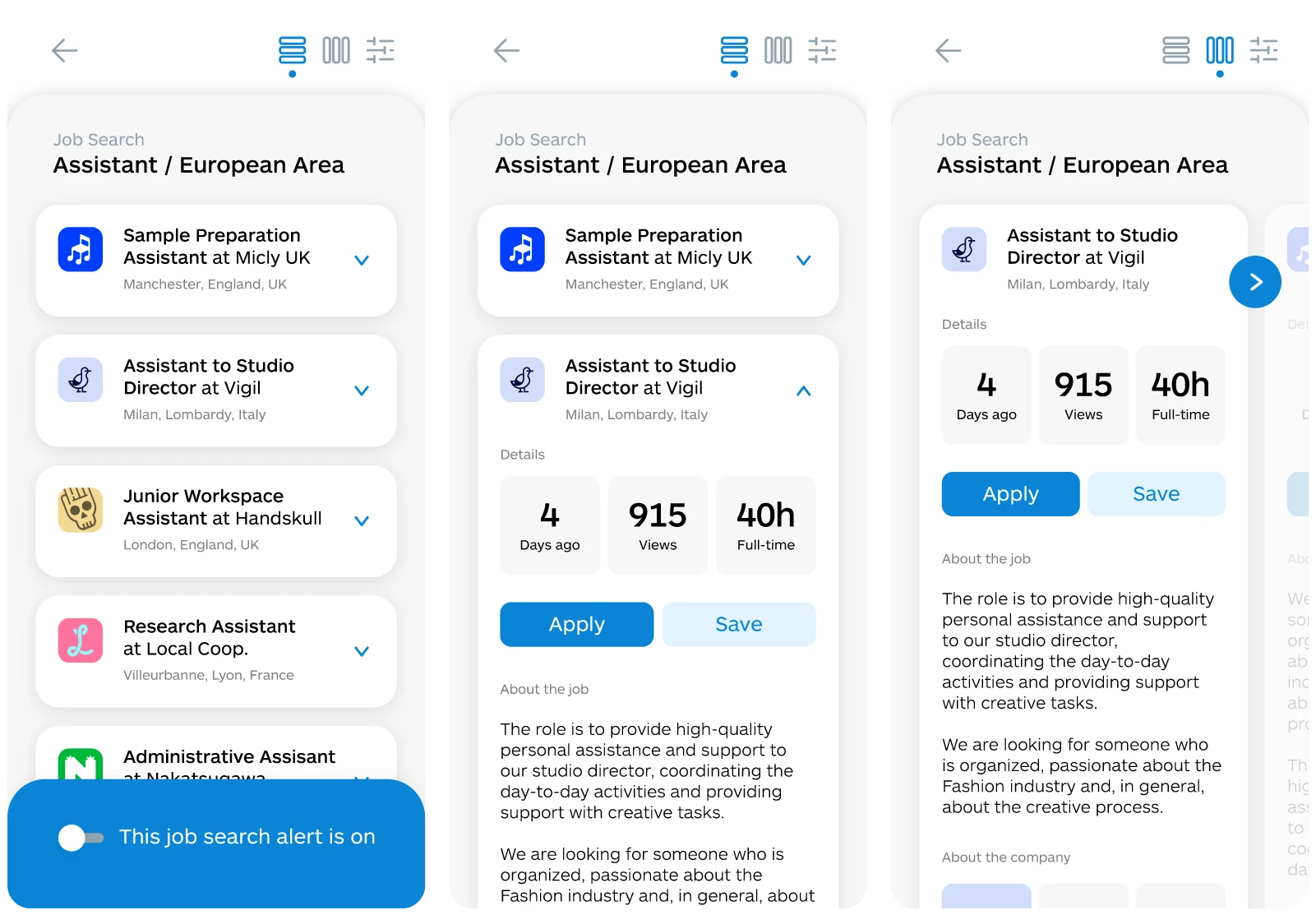
Information Hierarchy
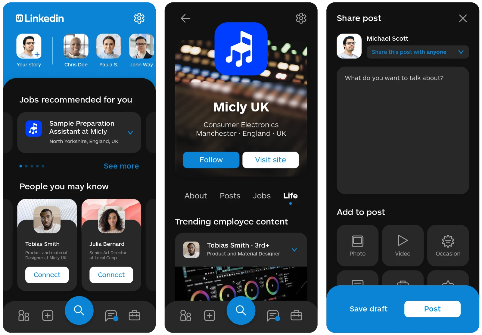
Addressing the cluttered UI, the redesign focused on establishing a clear information hierarchy and visual organization. Through iterative design processes, elements were rearranged to prioritize clarity, simplicity, and ease of navigation. Modules were redesigned to create a layered interface, with distinct grouping and visual differentiation between sections. A gray base layer provided contrast, while white modules emphasized key content and actions. The incorporation of a dark mode aimed to enhance readability and reduce eye strain, catering to diverse user preferences.
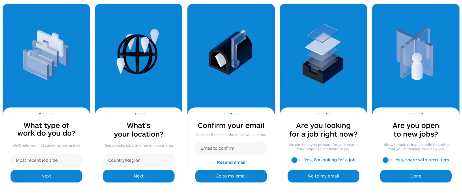
Onboarding Process
Recognizing the significance of the onboarding experience, the redesign sought to create a more engaging and intuitive process for new users. A series of abstract 3D minimal illustrations were developed to complement the onboarding journey, conveying a sense of depth and personality while aligning with the brand's identity. The onboarding screens were redesigned to utilize vibrant colors, animations, and motion design to transform the process into an exciting and immersive experience, setting a positive tone for users' interactions with the app.
Conclusion
While this redesign represents a personal endeavor to address the shortcomings of LinkedIn's UI, it acknowledges the complexity of such a task and the necessity of broader research and collaboration to develop a comprehensive solution. By leveraging insights from regular LinkedIn users and applying design principles aimed at enhancing user experience, the project serves as a showcase of design expertise and a testament to the potential for innovation within the realm of app design.
Overall, the LinkedIn App Redesign project highlights the importance of continual iteration and adaptation in response to evolving user needs and design trends, paving the way for a more engaging and user-centric social networking experience.
Ice Cream Disaster
Previous project
Visualittle
Next project
LET'S TALK! ✨
I'm currently seeking new opportunities! Let me know if my skills could be a good fit for your team.
MAIL ME